I'm a fan of high-quality representation of data. Be it typesetting, plotting, technical drawings or circuit schematics. And when it comes to plots, the output most applications deliver are nothing short of abysmal. If your plots are not available in a vector format, they are useless. If you decide to plot light-green lines on white background, that is utterly useless. If your axis labels read “db(mag(scatter(port1,port1)))” without the option of changing them: useless.
Luckily, most applications recognise that they suck at producing high quality plots and provide ways to get the numeric data out of them to use a dedicated utility to generate publication quality plots. The upside with that is, that all your plots will also look uniformly - which is important if you are working on something like a paper or thesis, where you'll surely want a consistent high-quality look to what you are preparing.
One such program is my good old friend “gnuplot”. I've written a fair number of small tools that turn data from simulators and measurement equipment into gnuplot scripts or into gnuplot-digestable formats. Gnuplot produces high-quality scalable plots and is immensely powerful, to satisfy most if not all of your plotting needs. However this story is not about gnuplot.
Because sometimes, I feel like I either hit the limit of gnuplot's capabilities or the language you control it by seems to get in the way. Sometimes I just want to create a sort of plot, that I think should be trivial to produce, and when I try it's just very very hard, while other things that looks incredibly hard seem trivial to create with it.
When you look for alternatives, your attention will quickly turn to “matplotlib”. That's a Python library for producing all sorts of plots and all of them in publication quality. Actually, together with NumPy and SciPy it forms a set of tools to tackle scientific and numeric problems. But let's not get distracted by that.
In the lab, we got a fairly big number of high-end measurement equipment, like high-bandwidth digital scopes, spectrum-, logic-, network-analyzers and the like. And the plots these things produce vary from mildly irritating to complete and utter crap. But that's okay, since there are usually ways to that the actual data out of them and into our high quality plotting engines (be it gnuplot or matplotlib).
Today I copied a dataset from a Rohde&Schwarz network analyzer measuring the Scattering Parameters of a setup with two wifi-antennas (one for 2.4GHz and the other in the 5GHz band) from 9kHz to 8.5GHz, so I had something to throw matplotlib against in the evening.
What S11 roughly represents (for those of you who are too lazy to read the wikipedia entry on scattering parameters) with respect to the antenna is this: The analyzer blows sine waves of all frequencies in the measured range into the antenna and looks at how much of the wave came back to it. For frequencies at which an antenna works, that value is typically quite small since most of the wave is supposed to be send off into the air. For frequencies at which the antenna doesn't work, a lot of the wave is reflected back to the analyzer. If everything of a wave is reflected and not otherwise lost on the way, incident and reflected amplitudes are the same and the magnitude of S11 at that frequency is 1 - the largest possible value in this kind of setting.
With two ports (like here with the each of the two antennas connected to one port) you get more scattering parameters: S22 is like S11 but for the second port. S21 describes how much of a wave from port 1 arrives at port two and S12 is the same just in the other direction.
Scattering parameters are usually plotted in logarithmic scale (S11log = 20·log10(|S11|)): A value of 1 would correspond to 0dB; 0.1 would be -20dB. So with this 2.4GHz antenna, you'd expect S11 to be small (like -10dB) around 2.4GHz and not-so-small everywhere else.
The network analyzer exports its datasets in touchstone format. A "s1p" file in that format has three columns. Since scattering parameters are complex numbers, the lines look either like this:
frequency real(S11) imag(S11)
Or like this:
frequency magnitude(S11) angle(S11)
"s2p" files contain the scattering parameters of a two port system (i.e. S11, S22, S21 and S12) in very much the same way. Either:
frequency real(S11) imag(S11) real(S21) imag(S21) ...etc...
Or:
frequency magnitude(S11) angle(S11) magnitude(S21) angle(S21) ...etc...
The Rohde&Schwarz analyzer uses the former version. The touchstone files also contain header lines (that define how the lines and columns are formatted, if you don't know the format) and comments at the top.
So. I got a "s2p" file that contains the measurement data and I want to plot the S11 values (representing the reflection data at port one, where the 2.4GHz antenna was connected). This is pretty easy to do in gnuplot, so matplotlib better doesn't make it too hard or I'll be demotivated massively. :)
Some constraints: The Y-axis should be labeled "S11 [dB]" and the X-axis should be labled "frequency [GHz]". It should be a plot, that you can use in a regular document: That means no title, since there will usually be a caption below or above the plot's figure in the document. And it also means that there should be minimal bounding box around the plot, so that no space is wasted. Also, it should obviously be a scalable format. I'd also like an extra tick at 2.4GHz on the frequency axis.
So postscript, pdf or svg. Proper inclusion in LaTeX documents is possible with postscript and pdf. And since there are more standalone pdf viewers than postscript viewers, let's settle for pdf.
Most of the work here is to read the dataset from the touchstone file. Luckily, the NumPy package provides a useful function to slurp in text-based datasets like this: loadtxt. So first things first:
import matplotlib.pyplot as pp
import numpy as np
Now we have access to ‘loadtxt’ as well as matplotlib's ‘pyplot’ API. The thing is, that we need to turn the real/imaginary pairs into actual complex numbers. But that's not so hard, if you know the ‘map’ function:
data = map(lambda x: [ x[0],
                       complex(x[1], x[2]),
                       complex(x[3], x[4]),
                       complex(x[5], x[6]),
                       complex(x[7], x[8]) ],
           np.loadtxt("wiki-antennas.s2p", skiprows=5))
Like I said, ‘loadtxt’ is the work-horse here. The ‘skiprows’ parameter just tells it to ignore the first five lines of the input file (that's the touchstone file's header and comments). The first argument to ‘map’ here is an anonymous function, that reorganises the data sucked in by ‘loadtxt’: It leaves the first column alone (that's the frequency entry) and then it takes the next columns in pairs and turns them into complex numbers. That does the trick.
You have to realise that my Python-fu is rather weak. I didn't know how to cleverly access an array of arrays column-wise. But the internet came the the recue:
def column(data, i):
    return [ row[i] for row in data ]
Now getting the data is trivial:
xx = np.multiply(1/1.0e9, column(data, 0))
yy = 20 * np.log10(np.abs(column(data, 1)))
Then prepare the plot:
# The font-size of the tick marks render a little big
# in pdf output by default. This needs to be tuned early:
fig = pp.figure()
plot = fig.add_subplot(111)
plot.tick_params(axis='both', which='major', labelsize=8)
plot.tick_params(axis='both', which='minor', labelsize=6)

# Prepare the plot, and take into account, that I like
# the plot's lines a tad ticker than the default.
pp.plot(xx, yy, linewidth = 1.5)
Now it's time to tune the plot to our liking:
# Extra tick at 2.4GHz:
pp.xticks(list(pp.xticks()[0]) + [ 2.4 ])
# Data range for X and Y axes:
pp.xlim(xx.min(), xx.max())
pp.ylim(yy.min() - 1, yy.max() + 1)
# A grid helps with orientation on the canvas:
pp.grid(True)
# Axes labels like specified:
pp.xlabel("frequency [GHz]")
pp.ylabel("S11 [dB]")
Finally, write the bugger to a file:
pp.savefig("mpl-antenna.pdf",
           # Remember? Minimal bounding box!
           bbox_inches = 'tight')
# Also, a PNG for the blog post as a thumbnail
# for the PDF:
pp.savefig("mpl-antenna.png",
           bbox_inches = 'tight')
# Alternatively, if uncommented the following
# shows the data in a plotting window:
#pp.show()
And here's the result (the image links to a scalable PDF version):
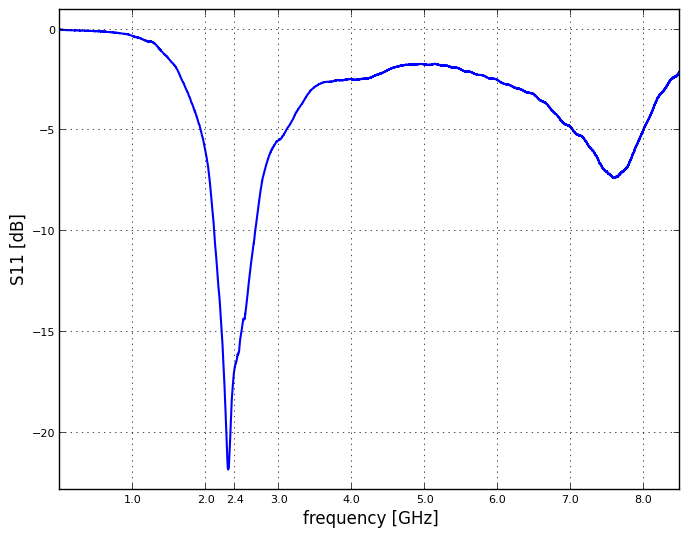
I can work with that. :)